.png)
Project Overview
Context
EmpOUR is a mentorship platform designed to connect users with experienced mentors who can guide them through personal and professional development. To access the mentor connection feature, users need to subscribe to EmpOUR Premium, available in two tiers: Basic (free) and Premium ($10/month). The subscription flow is a critical touchpoint in the user journey, as it directly impacts conversion rates and sets the tone for the user's relationship with the platform. My role was to redesign this flow to reduce friction, improve clarity, and create a more intuitive experience that guides users confidently through their decision-making and payment process.
The Journey
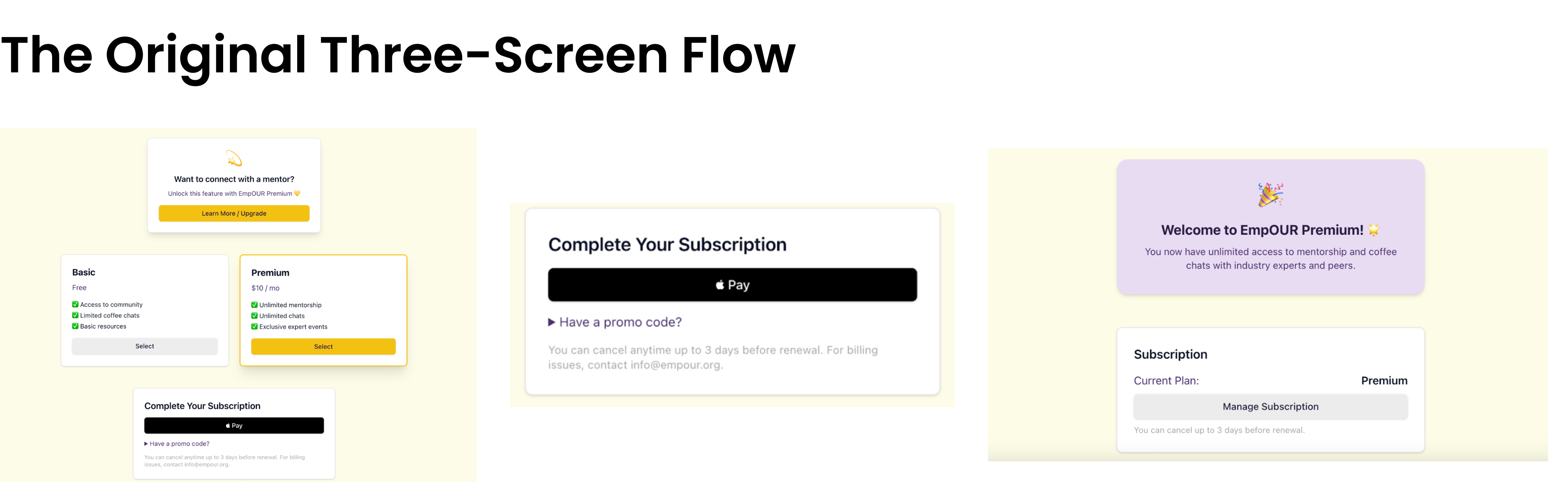
The original three-screen flow suffered from severe information overload and poor user experience design. The first screen attempted to do too much at once, asking users if they wanted to be a mentor, presenting two package options with pricing details, and offering an Apple Pay button all on the same interface. This created cognitive overload and forced users to make multiple critical decisions simultaneously without adequate context or breathing room. The second screen jumped straight into payment confirmation, giving users no opportunity to review their selection or understand the value they were receiving. The final welcome screen felt abrupt and disconnected from the journey. This cramped approach likely caused confusion, decision paralysis, and ultimately, subscription abandonment as users felt rushed through a financial commitment without proper guidance.

Final Outcome
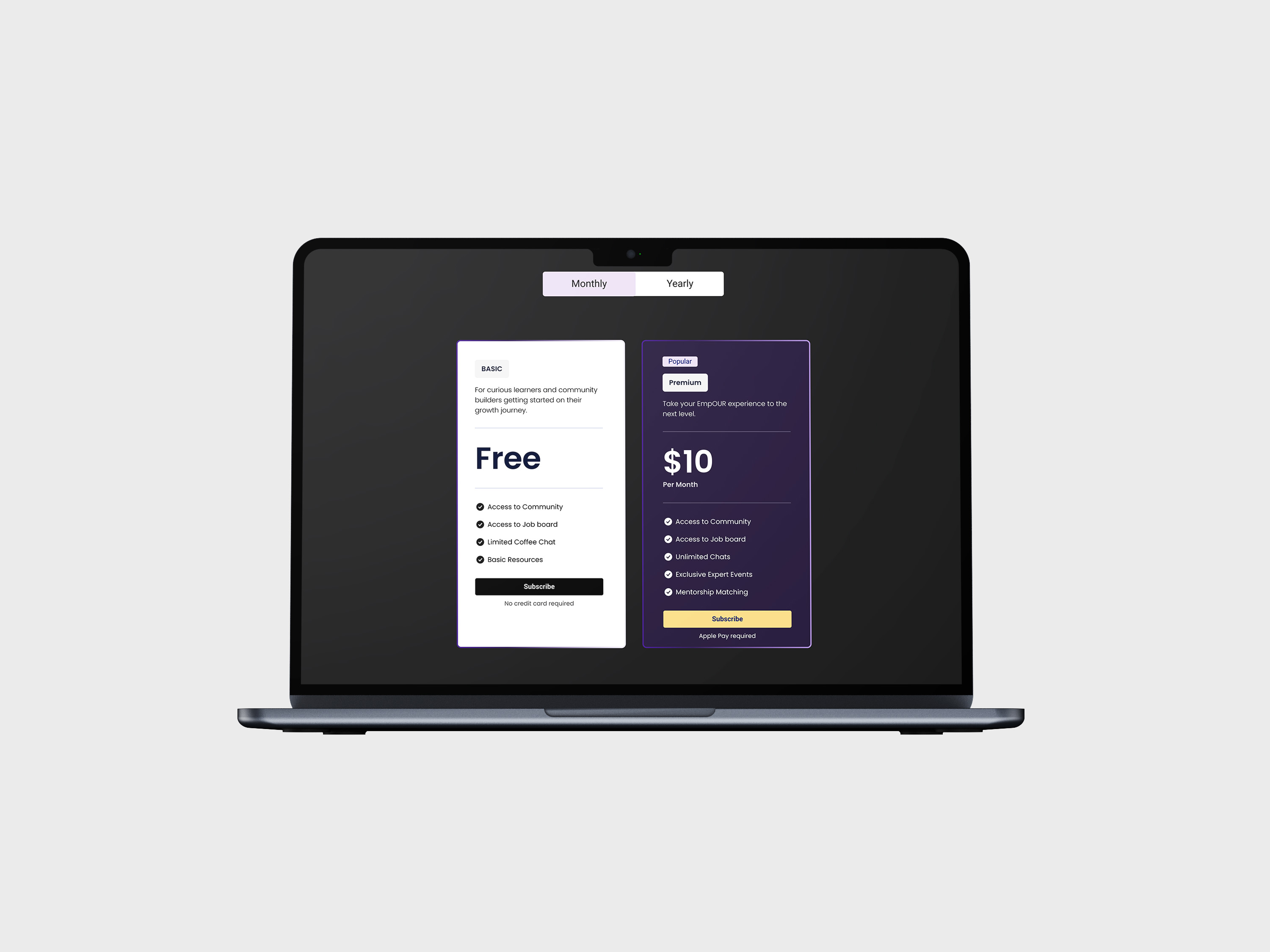
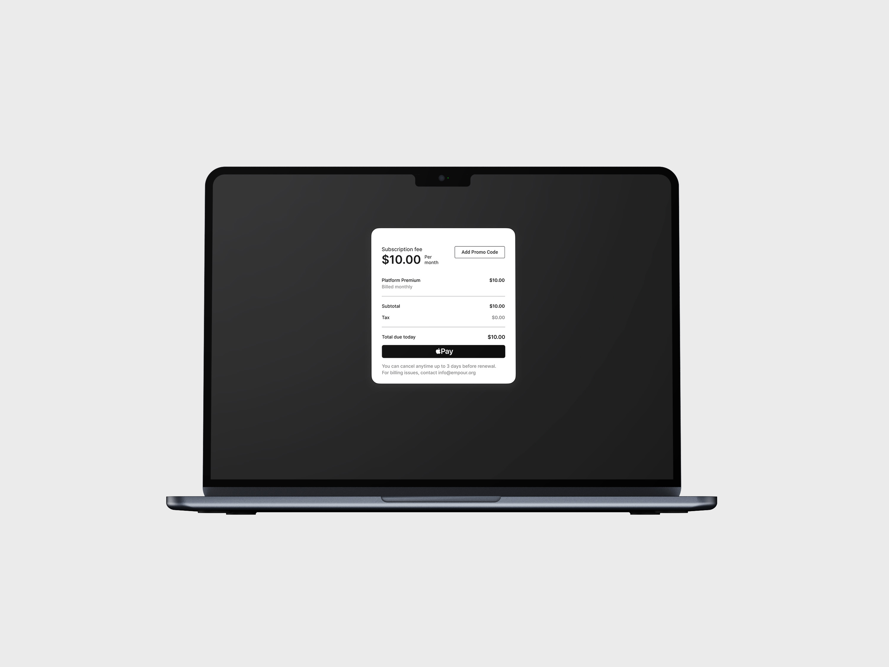
I redesigned the flow into five purposeful screens that follow principles of progressive disclosure and build user confidence step-by-step. The journey now begins with a feature gate modal asking "Want to connect with a mentor?" that clearly communicates the value proposition and offers users the choice to learn more or exit, reducing pressure and setting expectations. Screen two presents a thoughtful package comparison where users can review both tiers side-by-side with detailed benefits, allowing for informed decision-making without distraction. Once a package is selected, screen three confirms the subscription amount, giving users a moment to verify their choice before committing. Screen four initiates the Apple Pay authentication process with Face ID or Touch ID, maintaining security while feeling seamless. Finally, screen five celebrates the user's decision with a payment confirmation and warm welcome to EmpOUR Premium. This restructured flow respects the user's decision-making process, provides clarity at each step, and transforms what was once an overwhelming experience into a confident, user-friendly journey.


